Thursday, December 17, 2009

AACG polished logo

So, a while back, while in school i had an assignment where i had to look for an old logo, that looked outdated, and i had to make it look new and fresh. Plus! it had to belong to non-profit organization. so i looked around and found AACG; American Association for Crystal Growth.
These guys, are basically a community that gets together and discusses the ways and problems of growing crystals, mainly for scientific reasons. So, i went ahead and took the whole idea of crystals growing out of the logo, and i went with that, while at the same time trying to incorporate all the letters in the middle. so here you see the old logo they had and the new logo i finally came up with. Once it was turned in i was okay with it, but 2 years later i worked on it some more and made it even more sleek looking. I also took a look at my old illustrator files.... wow! they were a mess. groups of things that shouldn't have needed to be grouped and stuff like that, haha no merging of shapes... at all. haha but anyways, today i went to the website after my gf had told me several times tat i should try to contact them and show them the finished product. So i got their e-mail and told them part of the whole story, and basically told them that i re-did their logo and they can be free to use it, if they like it.


So now.... what you've been waiting for, haha... here it is:


so now i wait and see if they even like it, but since i actually went through with it, i thought i would post it. haha. Cross your fingers

Monday, December 7, 2009

FENIX logo/letterhead/envelope/business cards


So like it says.... these are the business cards, 3 different partners, so 3 different ones, with 3 different backs, that when collected all, and put together, form the following:


These are the 3 backs put together.


And here is the logo, letterhead, envelope, and a generic business card.

comment.

Sunday, December 6, 2009

MILK DUDS.... siiick


inspiration by ANImals: she likes the name... and i've never tried them. haha

for fun: wallpaper and jujubees!


here is my gu-gu ga-ga wallpaper cuz she's pretty damn sexy


Didn't know i liked them jujubee's hu

Saturday, November 21, 2009

yungAgain & ben


this is a new re-juvenating system, called Photoshop.


and well this is just big ben.
heh.... music is dope.... but that face, its hard to look at,
when you're trying to keep a straight face.

Friday, November 20, 2009

drunk chicken


sometimes you drink soOoo much, that even chairs
speak to you, and the theory that any meat taste
like chicken becomes non-existent.

Tuesday, November 17, 2009

Nice mug!


Oooooh baby! look at that MUG

DJ MOKES Business cards stage1


This is the first digital rough that i made along with him... so far he's diggin it, but we have more to add still..

Acronyms & Abreviations online


little something-something i made, cuz i was bored.

CLICK on it, to view the actual size.

Wednesday, April 29, 2009

DVD packaging...

So i am real late on this, since i didnt have the files with me all day... ugh.

but i finally got to them and here they are please give me feedback... any whether good or bad,
the bad is preferred. Cover isnt exactly done i guess.. so let me know what you guys think.


So first is the {slip} cover where a pack of 4 dvd go in.


next is the outside of the case that holds the Cd's
in this view you can see it closed as it is pulled out of the cover, open from the other side, and fully open looking only at the outside and not the other side {the inside, where the CD's are held


Next is the inside of the case with the Cd's and without the CD's


Last but not least is the Cd's by themselves.
Leave comments and i will give you a candy.

Saturday, April 4, 2009

(semi)Final packaging for White Rain

This is the first comp front and back.
I need to tweak the pictures a little and colorize them
and it should look better.


Boooyah-ka!

Thursday, March 12, 2009

White Rain...

Not to be confused with purple or chocolate Rain...

well, Here are the sketches of the structures and the front labels
All the photography is going to be b&w

Monday, March 2, 2009

Finishing touches

to the final mock ups are under way.

Just finished printing on the "kraft" paper which is not intended to be used on the small epson i have, but it always manages to surprise me.

And this is how they look once i printed them:


And i also found these cheap spices that will represent the inside of my design.

Because the actual brand might cost a little more to purchase, i went with these.


Final mock up pictures will be up once i get them done.

Tuesday, February 17, 2009

Revised Digital Format Plus Back section


Let me know what you think.

This will completely wrap around a cardboard cylinder.
And wax covered on the inside.

Oh, and the The stripe at the bottom will go all around.

Monday, February 2, 2009

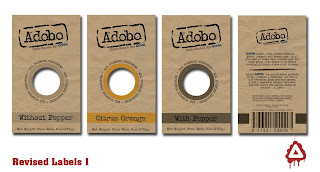
Goya Adobo line Package Sketches

So here are sketches for both the structure which wil more than likely be made of plastic... since its cheap to make and well, the best to keep seasonings.


Structure:

Label:Sketches suck, i know.

Monday, January 26, 2009

The Good, The Bad, And The Ugly of packaging.

So this is my first real blog... and its about Packaging, there are some good ones and some not so good ones.

+The bad Ones+

[1] Photo/Video Box


-first view, the brand is spaced out too much, it makes it almost to even read that as one word. -from the top view[2nd pic], you get to see what seems to be 3+ fonts all over the place showing no real
hierarchy.
-the negative space... oh that's right, there isn't any.
-Photo video? does anyone know where i can get a photo video?

[2] Paper Puncher


-Product isnt exactly selling itself, so you'd figure they'd spice up the packaging a little.
-very simple, but looks like they used a pre-selected template.
-And... the pencil at the bottom? maybe you're better off using a pencil to make holes.

[3] Pre-made Bread Pudding with Whiskey Sauce


So, Fresh and Easy...
-packaging is not bad, its good... but the one thing it lacks is information, and good packaging should include
that.
-It only has Microwaveable instructions, so if you dont own one like myself or someone you might know,
you're kinda asked out.
-Also, there is no sign on the front of the packaging, telling you that it is only microwaveable. So I wanted to
call them and ask them how the hell i was going to heat this up on my damn conventional oven... and the
damn thing had no telephone number either! what the? Well, anyways, Now on to...the good ones.

+The Good Ones+

[1] WD-40


-The company has been around forever. And well the packaging design... eh, its just classic i guess.
-But what i really like the most is how useful it is now... and how they adapted the straw looking thing so that
you dont have to look everywhere for it. Now it is very easy to just switch it back and forth from a regular
spray to using the straw, without having to look for it. I remember before they would just tape it to the side
of the bottle and then it would be full of the stuff and you would get dirty... and it would become a mess to
even use it.

[2] Seagrams(Whiskey)


-The actual bottle design is kept very simple and elegant, like the brand itself.
-The bottle design looks a lot like their glass design, but they added a grip to the back, which definitely helps when pouring.
-Also if you can read the top label, it says the tip comes with a Built-in pourer, which also helps when pouring,
and doesn't stall.


[3] Vaseline (mens products)
Soap/Lotion/Body wash


-Sharp, and very sleek look
-very simple and to the point
-And F-n Sexy.
-Also the design of the actual body wash helps so it doesn't slip while wet or soapy.


Thats all... leave some comments.